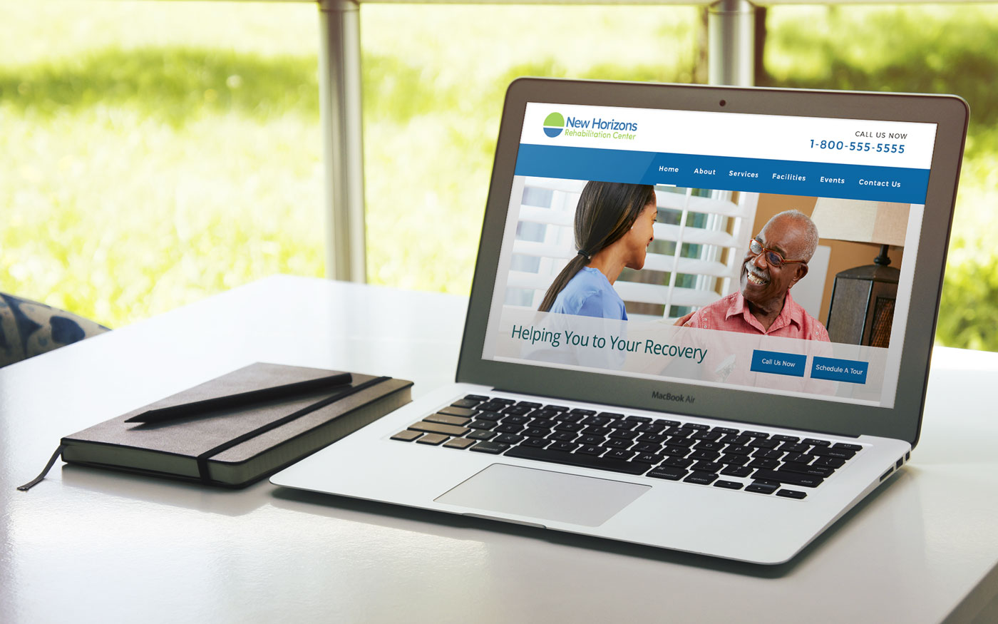
A web campaign study for a senior rehab center.
Design
The goal of the brand’s design was to convey a professional yet welcoming look and feel. Cool colors where chosen to symbolize a calm and positive feeling for recovery. It was a bit of a challenge to come up with a logo that was professional but not intimidating and cheerful but not too playful.
Development and Campaign
The goal of the center’s web presence is to get more potential patients to choose their center and to see the unique services that they offer. Based on the planned information architecture, Users will be able to call the rehab center from the site, contact them directly, see their monthly plan of events, and most importantly learn about the environment and goals of the company.
