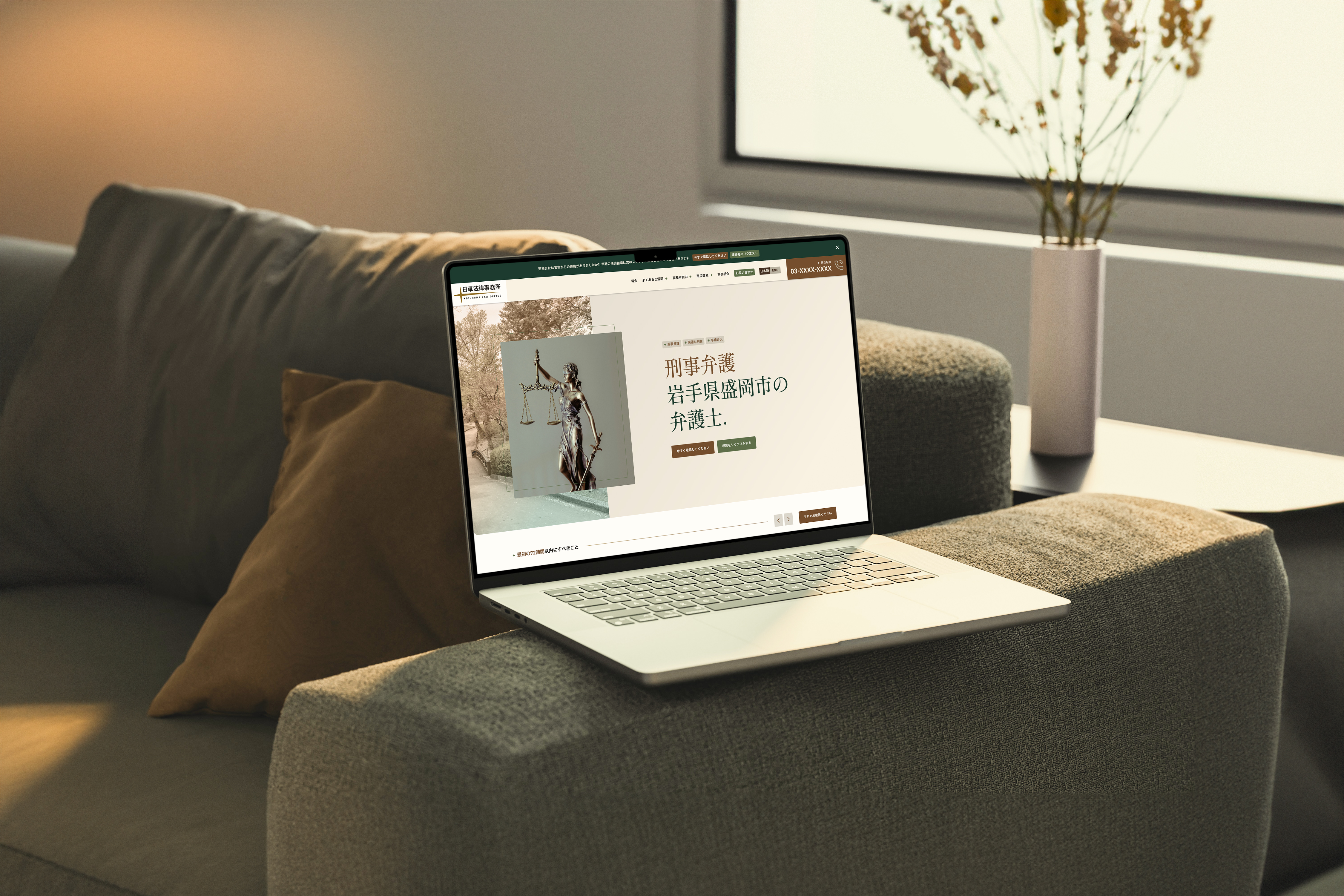
A web design concept for a small criminal defense law firm in Iwate, Japan, focused on urgent legal guidance, careful case navigation, and discreet client support.
Project Framing
& Inspiration
I created Higuruma Law Office around Hiromi Higuruma from Jujutsu Kaisen, a series I’ve been a fan of for years. Since his character is already closely tied to law and the courtroom, I treated the project as if I were designing an actual small criminal defense practice for him. The logo stays fairly simple to match that scope, with a small nod to Higuruma’s Executioner’s Sword rather than making the identity too anime-inspired.
I initially explored the identity through an English wordmark, then expanded it into a bilingual lockup as the project became more grounded in its Japanese setting. The final version pairs HIGURUMA LAW OFFICE with 日車法律事務所, keeping the original mark simple while making the identity feel more complete and specific to the firm.
For the broader visual direction, I looked at Morioka and the surrounding Iwate area rather than relying on typical law-firm imagery. The moodboard pulls from places like Morioka Castle and the city’s parks, with a lot of greenery throughout. That became the basis for the greens and warm umber in the palette and gave the site a calmer atmosphere without ignoring the fact that its content deals with stressful and often urgent situations.
Research &
Information Architecture
I approached the project knowing that the expectations I was familiar with wouldn’t automatically translate to a legal website based in Japan. My exposure to Philippine-based websites had already made me aware of how culturally different markets can handle information density, contact access, and page structure, so I spent more time studying how Japanese law firms organize navigation, services, and supporting content before shaping the site.
Trends and patterns tended to keep critical information visible upfront first, and I wanted to preserve that rather than flatten it into a more familiar Western layout. Instead, I borrowed selectively from contemporary web design, mainly spacing, contrast, and hierarchy, to give the content more structure and breathing room without losing the density and directness that felt appropriate to the market.
Because Higuruma Law Office was scoped as a small, focused practice, the site didn’t need a large or complicated page structure. I condensed information where it made sense and organized the homepage around the questions someone would realistically have when contacting a defense lawyer: what to do after being charged, how the client relationship works, what happens after hiring the firm, what services are offered, how fees work, and how to get in touch quickly.
Urgency influenced the entire structure of the site. Immediate actions stay visible, while the heavier legal information sits where it can be explored without getting in the way. The goal was to keep the depth expected from a Japanese professional website without making the experience feel unfamiliar.
Design System
& Components
The site has a lot of recurring information, so I kept the design system compact and reusable. A shared set of buttons, cards, accordions, form fields, navigation patterns, alerts, and other interface elements keeps the pages consistent without requiring a different treatment for every type of content.
The color system went through several rounds of adjustment as the project developed. I kept the forest greens and browns from the original direction, while refining their use for stronger contrast across text, icons, controls, and interactive states. Most of the site stays on light, neutral surfaces, with darker treatments used only where they add emphasis.
Final Design
The final design brings together the research, content structure, and visual direction established earlier in the project. The site keeps the amount of information expected from a Japanese legal website, but gives that content more control through hierarchy, spacing, typography, and repeated patterns. The result feels detailed without becoming visually noisy, and professional without making a small practice look larger or more elaborate than it needs to be.
Earlier research also shaped how different needs are handled throughout the site. Urgent legal concerns are given stronger visibility, while fees, FAQs, case examples, and supporting information have clearer places within the overall experience. The bilingual identity carries into the interface through a visible language toggle, allowing the Japanese and English versions to feel like parts of the same site rather than separate treatments.
The restrained green-and-ochre palette, simple identity, reusable components, responsive layouts, and localized content all work from the same set of decisions around scope, accessibility, information density, and visual restraint. The final screens are where those earlier choices come together as one complete project.
The Figma prototype can be previewed here